"If your company hopes to grow its business in 2019 and beyond, you need more than just a good idea. It's great if you have a product or service that everybody wants. But it's tough to sell if people don't know about it.
Before employing specific marketing methods, it's essential to grasp what it is you hope to achieve with your overall brand strategy. Commonly mistaken for straightforward business features like your logo, product or your company's website, your brand encompasses much more."Janae Ernstexplains to usin his article"Brand and Marketing Strategies, taking your business to the next level"
A good logo is synonymous with the brand it represents. Think about iconic brands such as McDonald's or Apple. Their logos are like an instantly recognizable shorthand for the business itself.
Many logos have a hidden meaning, often something that relates to the company’s backstory or a clever visual pun. After all, branding is all about storytelling.
But there’s another element that makes up the story of a logo: It is colour.
A logo’s color can say a lot about a brand. For established brands, a color can be intrinsically linked to the business’s identity. Think of Starbuck’s famous white and green coffee cups or Cadbury’s iconic purple wrapping. And for new brands, their logo color is an attempt to position their business with their desired customer.
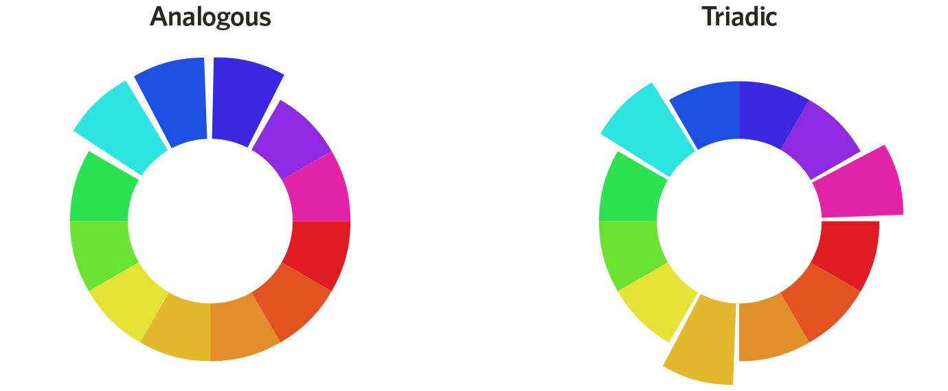
One reason people create logos in the first place is that visual recall is a powerful thing. And that’s exactly why canva.com have put together this logo color wheel—at a glance, you can see exactly how big-name brands use color.
Image source: Canva
Logo color and brand identity
The link between color and brand identity is strong. In the Journal of the Academy of Marketing Science, researchers Lauren Labrecque and George Milne explain that “like a carefully chosen brand name, color carries intrinsic meaning that becomes central to the brand’s identity, contributes to brand recognition, and communicates the desired image.”
In their research on color differentiation in the marketplace, Labrecque and Milne highlighted how certain industries frequently use particular colors.
For instance, they found that blue is used in over 75% of credit card brand logos, and 20% of fast food brand logos. Red, meanwhile, is found in 0% of apparel logos—but over 60% of retail brands.
For consumers confronted with advertising thousands of times a day, these visual cues can be an unconscious message about what they’re being sold, and by whom.
Image source: Canva
Color trends for men and women
One of the more interesting examinations of this topic is Joe Hallock’s work on “Colour Assignment.” Hallock’s data showcases some clear preferences in certain colors across gender (most of his respondents were from Western societies). The most notable points in his images are the supremacy of the color blue across both genders and the disparity between groups on purple.
It’s important to note that one’s environment—and especially cultural perception—plays a strong role in dictating color appropriateness for gender, which in turn can influence individual color choices. Consider, for instance, this coverage by Smithsonian magazine, detailing how blue and pink became associated with boys and girls respectively, and how it used to be the reverse.
Here were Hallock’s findings:
Men’s and women’s favorite colors
Men’s and women’s least favorite colors
Additional research in studies on color perception and color preferences show that when it comes to shades, tints, and hues, men generally prefer bold colors while women prefer softer colors. Also, men were more likely to select shades of colors as their favorites (colors with black added), whereas women are more receptive to tints of colors (colors with white added).
Although this is a hotly debated issue in color theory, I’ve never understood why. Brands can easily work outside of gender stereotypes — in fact, I’d argue many have been rewarded for doing because they break expectations. “Perceived appropriateness” shouldn’t be so rigid as to assume a brand or product can’t succeed because the colors don’t match surveyed tastes.
Color coordination and conversions
The psychological principle known as the Isolation Effect states that an item that “stands out like a sore thumb” is more likely to be remembered. Research clearly shows that participants are able to recognize and recall an item far better — be it text or an image — when it blatantly sticks out from its surroundings.
Two studies on color combinations, one measuring aesthetic response and the other looking at consumer preferences, also find that while a large majority of consumers prefer color patterns with similar hues, they favor palettes with a highly contrasting accent color.
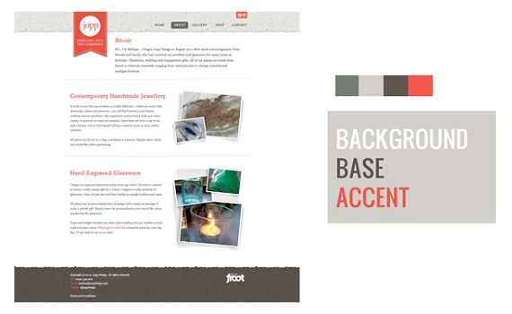
In terms of color coordination, this means creating a visual structure consisting of base analogous colors and contrasting them with accent complementary (or tertiary) colors:
Another way to think of this is to utilize background, base, and accent colors, as designer Josh Byers showcases below, to create a hierarchy on your site that “coaches” customers on which color encourages action.
Why does this matter? Although you may start to feel like an interior decorator after reading this section, understanding these principles will help keep you from drinking the conversion rate optimization Kool-Aid that misleads so many people.
Consider, for instance, this oft-cited example of a boost in conversions due to a change in button color.
The button change to red boosted conversions by 21 percent. However, we can’t make hasty assumptions about “the power of the color red” in isolation. It’s obvious that the rest of the page is geared toward a green palette, which means a green call to action simply blends in with the surroundings. Red, meanwhile, provides a stark visual contrast, and is a complementary color to green.
We find additional evidence of the isolation effect in multivariate tests, including one conducted by Paras Chopra published in Smashing Magazine. Chopra was testing to see how he could get more downloads for his PDFProducer program, and included the following variations in his test:
Can you guess which combination performed the best? Here were the results:
Example #10 outperformed the others by a large margin. It’s probably not a coincidence that it creates the most contrast out of all of the examples. You’ll notice that the PDFProducer text is small and light gray in color, but the action text (“Download for Free”) is large and red, creating the contrast needed for high conversions.
A final but critical consideration is how we define “success” for such tests. More sign-ups or more clicks is just a single measurement — often a misleading one that marketers try to game simply because it can be so easily measured.
Why we prefer “sky blue” over “light blue”
Although different colors can be perceived in different ways, the descriptive names of those colors matters as well.
According to a study titled “A rose by any other name…,” when subjects were asked to evaluate products with different color names, such as makeup, fancy names were preferred far more often. For example, “mocha” was found to be significantly more likeable than “brown,” despite the fact that the subjects were shown the same color.
Additional research finds the same effect applies to a wide variety of products; consumers rated elaborately named paint colors as more pleasing to the eye than their simply named counterparts. It has also been shown that more unusual and unique color names are preferable for everything from jelly beans to sweatshirts. For instance, crayon colors with names such as “razzmatazz” were more likely to be chosen than names such as “lemon yellow.”
3 steps to creating your own logo
01. Industry research
Ask yourself, What’s this business all about—and who is the audience? Remember that your logo should appeal to your ideal customer. And remember to look at the competition. Your brand strategy will determine whether you’re more comfortable creating something that breaks with industry tradition, or keeps to the established trends—but knowing what else is out there is crucial.
02. Choose your logo type
There are two dominant kinds of logo: wordmarks and symbols. A wordmark is where the name of the company is the focus of the logo. This kind of logo relies on a good typeface and strong color choice. A symbol logo relies on iconography to make the brand recognizable.
03. Choose your color scheme
Think about the associations you’d like people to make with your brand. What colors best support this? The colors you choose will probably have a life beyond the logo – they might appear on your website, or business cards, etc.
Keynote Speaker on Digital Marketing and Entrepreneurship, Social Media Strategist, Trainer, Writer, Blogger, Mother, Daughter, Granddaughter, Dreamer.
Follow her on:
Twitter: @MiliPonceOliver
Instagram: @MiliPonceOfficial
Facebook: /MiliPonceOliver
Pinterest: /MiliPonce
LinkedIn: /in/MiliPonce
The Psychology Of Colours And How To Create A Strong Brand
Reviewed by Mili Ponce
on
Monday, March 18, 2019
Rating: 5
Visits
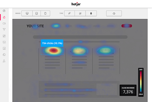
Learn For FREE What Your Website Visitors Do On It
Abigail Gamble - Former Executive Editor & Podcaster
A recent BA English graduate, who loves to write, research, travel and the theatre
Sarah Cousins - Contributor
I write about ideas. My background is in strategic marketing, PR, social media and project management, my future is in ideas. I’m professionally qualified with the Chartered Institute of Marketing, holding a postgraduate diploma in strategic marketing. After working for the BBC I spent a lot of time in the education sector. I’ve flirted with freelance work and consultancy but the BIG thing I’ve noticed is that people want practical results (ridiculously fast). I help boutique business owners and online entrepreneurs. One powerful idea can change your world, last a lifetime or even create a legacy. You can find me on Twitter @The_Ideas_Girl
Victoria Greene - Contributor
Victoria Greene is an e-commerce marketing expert and freelance writer who derives an unusual level of enjoyment from browsing supermarkets. You can read more of her work at her blog Victoria Ecommerce


 Additional research in studies on color perception and color preferences show that when it comes to shades, tints, and hues, men generally prefer bold colors while women prefer softer colors. Also, men were more likely to select shades of colors as their favorites (colors with black added), whereas women are more receptive to tints of colors (colors with white added).
Although this is a hotly debated issue in color theory, I’ve never understood why. Brands can easily work outside of gender stereotypes — in fact, I’d argue many have been rewarded for doing because they break expectations. “Perceived appropriateness” shouldn’t be so rigid as to assume a brand or product can’t succeed because the colors don’t match surveyed tastes.
Additional research in studies on color perception and color preferences show that when it comes to shades, tints, and hues, men generally prefer bold colors while women prefer softer colors. Also, men were more likely to select shades of colors as their favorites (colors with black added), whereas women are more receptive to tints of colors (colors with white added).
Although this is a hotly debated issue in color theory, I’ve never understood why. Brands can easily work outside of gender stereotypes — in fact, I’d argue many have been rewarded for doing because they break expectations. “Perceived appropriateness” shouldn’t be so rigid as to assume a brand or product can’t succeed because the colors don’t match surveyed tastes.
 Another way to think of this is to utilize background, base, and accent colors, as designer Josh Byers showcases below, to create a hierarchy on your site that “coaches” customers on which color encourages action.
 Credit: Josh Byers
 Credit: Joshua Porter
 Can you guess which combination performed the best? Here were the results:
 Example #10 outperformed the others by a large margin. It’s probably not a coincidence that it creates the most contrast out of all of the examples. You’ll notice that the PDFProducer text is small and light gray in color, but the action text (“Download for Free”) is large and red, creating the contrast needed for high conversions.
A final but critical consideration is how we define “success” for such tests. More sign-ups or more clicks is just a single measurement — often a misleading one that marketers try to game simply because it can be so easily measured.
Example #10 outperformed the others by a large margin. It’s probably not a coincidence that it creates the most contrast out of all of the examples. You’ll notice that the PDFProducer text is small and light gray in color, but the action text (“Download for Free”) is large and red, creating the contrast needed for high conversions.
A final but critical consideration is how we define “success” for such tests. More sign-ups or more clicks is just a single measurement — often a misleading one that marketers try to game simply because it can be so easily measured.


 Reviewed by Mili Ponce
on
Monday, March 18, 2019
Rating:
Reviewed by Mili Ponce
on
Monday, March 18, 2019
Rating:


 Entrepreneur, international speaker on Social Media Marketing. First one in the UK to write and speak in conferences about Twitter as a marketing tool. Consultant to Corporate Companies, Government Organizations, Marketing Managers and Business Owners.
 Aspiring novelist with a passion for fantasy and crime thrillers. He hopes to one day drop that 'aspiring' prefix. He started as a writer and soon after he was made Executive Editor and Manager of the team at Social Songbird. A position he held for 5 years.
 Adrienne is a passionate writer with experience in editing, content creation, and social media marketing. She’s a lover of animals, helping others improve their writing, and 2000s pop culture.
 Musician, audio technician, professional tutor and a Cambridge university English student. Interested in writing, politics and obsessed with reading.
 Recently graduated with a BA in English Literature from the University of Exeter, and he is about to study an MA in Journalism at the University of Sheffield. He is an aspiring journalist and novelist; in his free time he enjoys playing chess, listening to music and taking long walks through nature.
 Lucy is an undergraduate BSc Politics and International Relations student at the London School of Economics and Political Science.
 Anna Coopey is a 4th year UG student in Classics at the University of St Andrews in Scotland. She is a keen writer and researcher on a number of topics, varying from Modern Greek literature to revolutionary theory.


 Ellie is a recent BA English Literature graduate and aspiring publisher with a passion for writing. Her favourite pastimes include reading and shopping.