New Myspace Released To All Users

After a successful beta testing stage, the all-new rebranded Myspace has been released to the World Wide Web. The Justin Timberlake-backed redesign focuses on music sharing and discovery, with features similar to Pandora and Spotify, but also has a strong social media element.
When the re-re-re-release of Myspace was announced last year, there was a mixed response. Some welcomed the announcement, fond memories of the original social media giant fresh in their minds. Others groaned in despair, having seen the social media site die, get resurrected and die again, only to see the site get resurrected once more.
The topic split public and professional opinion in two, perfectly illustrated by the lambasting The Next Web reporter Harrison Weber received from his TechCrunch counterpart Drew Olanoff after he wrote a gushing article contradictory to Olanoff’s own damning beliefs concerning the new Myspace.
Now, after having to read all the journalists’ opinions, arguments, points and counterpoints, the general public has the opportunity to see what they think of the service themselves.
So, who’s right, Weber or Olanoff?
Well, on first impressions alone, Weber has a strong case when he describes the service as “beautiful”. The site has a crisp, monochrome appearance, with a complex interface designed to take up little room on the screen and clean smooth popups to broaden the various toolbars.
 There are two toolbars with which users can navigate the site. One, at the bottom of the screen, sits just beneath the side-scroller and is ever-present. It has the Myspace home, profile and Discover buttons, as well as notifications, messages and search.
Dominating on the bottom bar is the song currently playing. Any song chosen will continue to play as a user navigates the site, and they can queue other songs to listen to after. The toolbar also has pause/play, skip, rewind, shuffle and repeat buttons.
When you hover over the ‘what’s playing’ section of the toolbar, an extension pops up with all your queued songs and history. Users can save their favourite queues or create mixes, go on the radio or send messages.
The one issue with the bottom toolbar is, because the side-scroller is directly above it, the queue popup obstructs the scroll bar. Of course, this is no issue for users with touchscreen devices or mouse scrollers, which work up-left, back-forward.
 The toolbar to the left of the screen changes depending on whether the user is on their profile page, the Myspace home page or the Discover page. The profile page and the Myspace home page are very similar to those on Facebook, with the home page displaying updates from people, songs and other media that you have connected with in a stream, and the profile page displaying your own activity.
The Discover page is unique to the site. From the Discover page you can find people, music, videos and whatever is trending on the site at the time. Another issue I have with the site is apparent on the Discovery panel: there is a vast amount of white space between the links and the bottom toolbar. Of course, it’s only there to take the pop up Queue into account, but it looks ugly. Also, when the Queue pops up, there should be at least a little space between it and the links, otherwise it just seems to overlap them.
There is also an issue with the videos that you Discover on the site. The videos that are directly uploaded onto the site will continue to play in the bottom right hand corner of the screen as you navigate around Myspace, with the option to maximise the video if you wish to give it your full attention. Videos embedded from YouTube, however, will stop as soon as you navigate away from the page. Granted, the fact that the majority of videos will play continuously is fantastic, but on more than one occasion I have left a page halfway through a YouTube video, forgetting that this stops it.

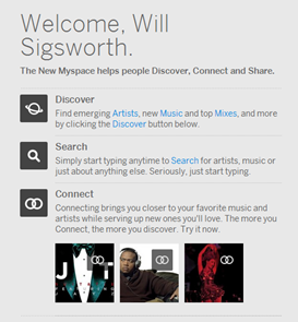
The Search page is great, with an enormous search bar omnipresent at the top of the screen and clever categorisation to narrow down searches. Songs, Artists, Albums, People, Mixes and Videos are the six categories, all of which can be easily navigated between using the left-hand toolbar.
The Myspace music database seems to be pretty comprehensive, but is dominated by classics and American chart music. To test Myspace I searched for Journey and up came pretty much their entire discography in Songs. The same happened when I searched for Blur and relatively recent UK band Foals.
Bands with “Journey” or “Blur” in their name also came up when I searched, and bands with names or song names with words similar to “Foals”, suggesting that the search engine can deal with spelling errors and mistakes.
I then searched for a couple of songs that are yet to be released, “Inhaler” by Foals and “Not A Saint” by Vato Gonzalez vs. Lethal Bizzle & Donae’o – both are enjoying relative success in the UK charts. Admittedly, this is an unfair test: it should be expected that unreleased music would not have found its way onto a legitimate site like Myspace. Both tracks, however, can be found on YouTube.
Of course, this will undoubtedly change if more artists begin using their site, as anyone has the ability to upload their own music from the Manage tab.
 Hovering over a song will give the option to play or queue it. Hovering over the Venn diagram-like Connect symbol gives you further options, including Share, Add to Mix and make Profile Song.
Clicking on the song opens up a sidebar on the right of the screen showing you similar songs, similar artists, who has already connected to the song and gives you the option to leave a message if you are connected to the song yourself.
If you log out, when you log in the song you were listening to before will immediately begin playing again, with all your queued and listened to songs still in your playlist.
“Connect” is the all important button in the new Myspace. It’s best to think of it as a Like, Follow and Friend Request button all in one. With it, you can show that you like certain songs and follow certain artists. If you are an artist yourself other users can Connect with you.

To get started on the site, just go to www.myspace.com (the site still has the same domain name, but the URL will change to new.myspace.com once you arrive). When there you will be greeted with an image of the site’s celebrity sponsor, JT, looking dapper in a suit and tie, with a link to his new single “Suit & Tie”.
Two buttons dominate the screen: “Join” and “Sign In”. Users also have the option of clicking a link right at the top of the screen which takes them to the old Myspace. Clicking Join will take you to the usual form with details to fill in – name, email, gender, etc. – with three alternative options: log in with Twitter, Facebook or your original Myspace account. Artists can transport their original Myspace music from the classic site to the new one.
Once you have set up your account – complete with interests, description profile and cover image and location – you will be taken to the Myspace home page. Immediately noticeable is Myspaces unique design choice: the side-scroller.
Instead of scrolling top to bottom, Myspace pages are scrolled sideways – except the lists beneath each search category. Like Pinterest, Myspace pages are limitless but, due to the crispness of the sites design, the page can take a while to load when you reach the edge of what has already loaded and, on occasion, freezes altogether.
So, Weber is right that the site is beautiful and, despite its flaws, easy and rewarding to use. However, as Olanoff argues, who really cares about Myspace any more? With Spotify and Pandora providing a similar service, and YouTube an arguably better one, will the social media side attract users? Myspace is free to use, which works in its favour, but this also begs the question, how will it stay afloat with no obvious income?
I disagree with Olanoff on one point: ‘“Pretty things”’, he says ‘don’t win. Facebook is ugly, has 950M users. Twitter? 140M and boring, design wise, for the most part. It’s content that wins.’
In my opinion neither Facebook nor twitter are ‘ugly’. In fact, the beautiful simplicity of their designs is what attracts users in the first place, allowing easy navigation and quick discovery.
At this time it is too early to say whether Myspace will be successful, but the sites design, the ability to download your own music and the depth of its database suggest it could contend with both its music streaming and its social media rivals.
Have you set up an account on the new Myspace? What do you think?
Contact us on Twitter or leave your comments below.
Will Sigsworth
Follow us @SocialMediaF & @WillAtSMF
www.socialmediafrontiers.com
New Myspace Released To All Users
 Reviewed by Unknown
on
Wednesday, January 16, 2013
Rating:
 Reviewed by Unknown
on
Wednesday, January 16, 2013
Rating:


 Entrepreneur, international speaker on Social Media Marketing. First one in the UK to write and speak in conferences about Twitter as a marketing tool. Consultant to Corporate Companies, Government Organizations, Marketing Managers and Business Owners.
 Aspiring novelist with a passion for fantasy and crime thrillers. He hopes to one day drop that 'aspiring' prefix. He started as a writer and soon after he was made Executive Editor and Manager of the team at Social Songbird. A position he held for 5 years.
 Musician, audio technician, professional tutor and a Cambridge university English student. Interested in writing, politics and obsessed with reading.
 Recently graduated with a BA in English Literature from the University of Exeter, and he is about to study an MA in Journalism at the University of Sheffield. He is an aspiring journalist and novelist; in his free time he enjoys playing chess, listening to music and taking long walks through nature.
 Lucy is an undergraduate BSc Politics and International Relations student at the London School of Economics and Political Science.
 Anna Coopey is a 4th year UG student in Classics at the University of St Andrews in Scotland. She is a keen writer and researcher on a number of topics, varying from Modern Greek literature to revolutionary theory.
